In 2019, PMMA began a rebranding process after developing a new logo that would unify the senior living system’s brand and image. A rebranding process was initiated with PMMA’s marketing firm.
The challenges were great. The new mark had to reflect PMMA’s core values, mission, and beliefs. It needed to be simple, but sophisticated enough to convey the high quality of care and service found in PMMA communities. It also needed to be practical and demonstrate reliability and integrity.
Several logotypes were created, but it was difficult to find one icon that would unite both the urban and rural campuses of PMMA. During this process, PMMA’s newest campus was going through a branding process as well. During the logotype presentation, inspiration struck. One of the proposed brand marks could unite all the PMMA communities together under one icon, with the flexibility to incorporate the unique brand colors already in use at the 15 other PMMA communities and the PMMA corporate office.
Once leadership bought into the idea, I worked directly with the marketing agency on developing the style for the logo and incorporating PMMA’s colors, including those used by the existing Aberdeen communities whose logos utilized different tartans.
Careful thought was put into how to identify the communities that do not have Presbyterian Manors in their names as well as how to unify the brand under one symbol.
At its board meeting on March 5, 2019, the PMMA Board of Trustees approved a new logo set for the PMMA system.
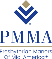
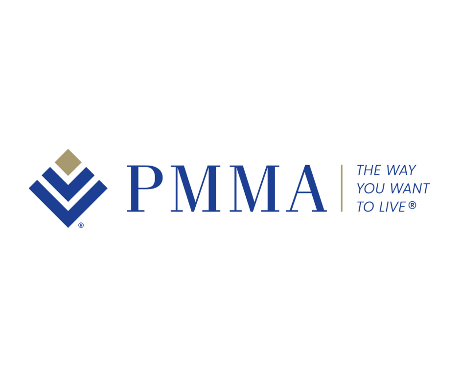
The elements of the logo represent the three levels of living (independent, assisted, and healthcare) or outstretched arms that protect and serve our residents. These elements are blue to suggest energy and action because it empowers residents to remain healthy, active, and engaged. It also underscores respect and understanding that seniors, as citizens and individuals, retain their rights to life, liberty and the pursuit of happiness.
The logo has three different diamond colors, utilizing colors from the previous PMMA logos. The diamond elements sit atop the “V” elements to signify the core purpose of our organization. The PMMA gold diamond relates to the Presbyterian Manor gold standard for providing quality senior services; the purple diamond refers to the faith-based mission that is fulfilled daily by the staff members at each PMMA community; the Aberdeen green diamond refers to the commitment to healthy living through the intentional balance of physical, emotional, social, spiritual and intellectual components of wellness.
Once the logo was approved, the work began to update the community and PMMA logos across all of PMMA’s physical and digital properties as well as to get the logo registered to PMMA to protect the logo and icon.
I utilized a spreadsheet to determine what needed to be updated and who would be responsible. We regularly reviewed the spreadsheet to ensure the pieces were updated in a timely fashion. Once registration was achieved, the process began again to ensure the usage of the new logos with the registration marks in the correct locations.
I was also responsible for determining any adjustments to the logos to fit the spacing needed for nametags, printing standards and more. All final designs were reviewed and approved before use.
No rebranding effort is successful without developing a comprehensive style guide. Utilizing an existing style document, I updated the documentation for the new logos and all other related iconographies for the organization, rewriting key areas to reflect the logo change. The result was a single reference document distributed to all vendors and leadership.
New PMMA Logos 2019